Terms & Conditions Page
Terms & Conditions Page
UX/UI Design
Case Study
The problem
The problem
Terms and Conditions: the part no one reads but legally needs to be present. Analysis showed that despite making it this far into the sales funnel, about 3% of customers were still abandoning at this page. What friction could be causing them to give up after making it almost to the end?
Terms and Conditions: the part no one reads but legally needs to be present. Analysis showed that despite making it this far into the sales funnel, about 3% of customers were still abandoning at this page. What friction could be causing them to give up after making it almost to the end?
Existing experience
Existing experience
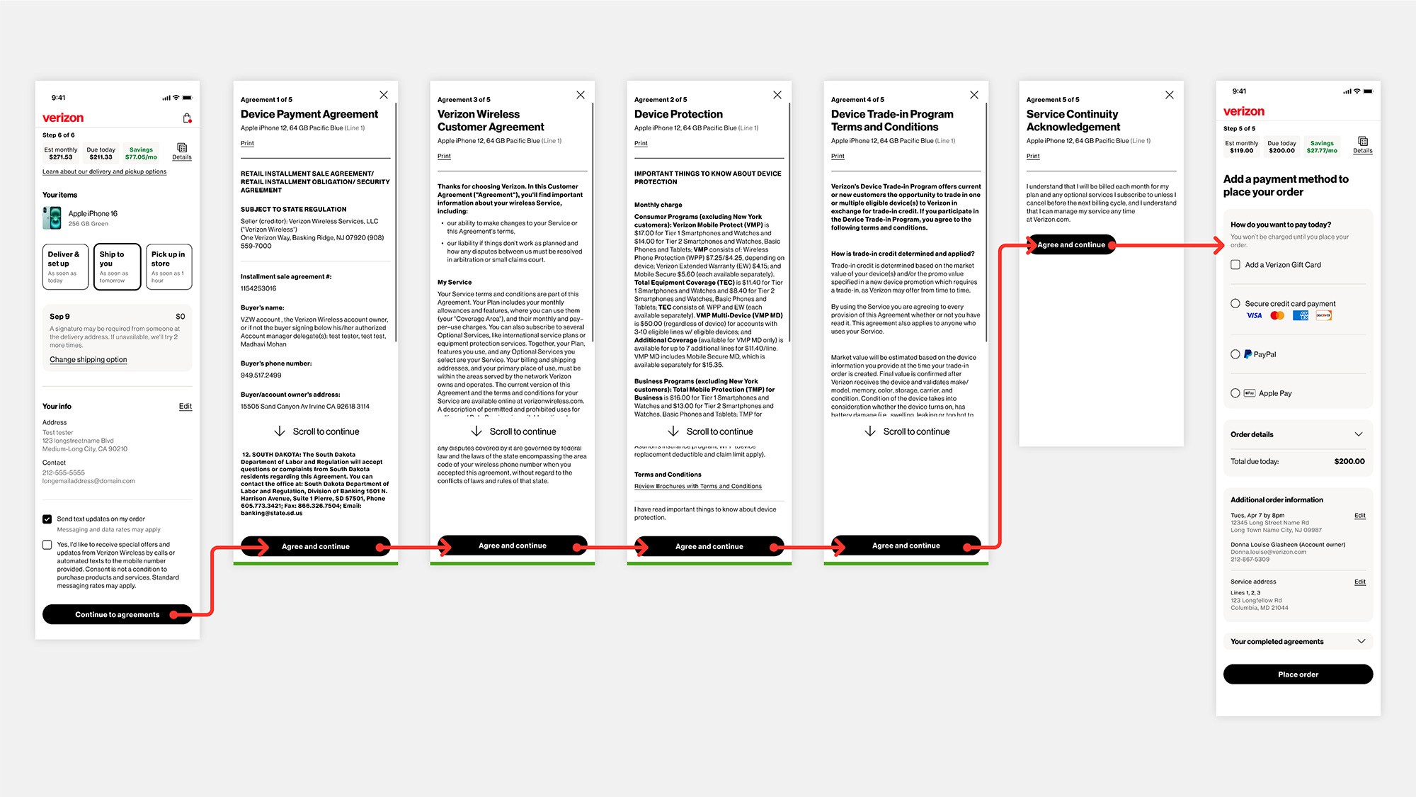
Sandwiched between the order fulfillment (delivery options) and the payment/order review pages, the existing terms and conditions presented as a series of full-screen modals that required the customer to scroll and click an "Agree" CTA button. Depending on which options and services a customer added, this process involved a minimum of 5 scroll and clicks, each one appearing individually, and the potential for over 9 in total.
Sandwiched between the order fulfillment (delivery options) and the payment/order review pages, the existing terms and conditions presented as a series of full-screen modals that required the customer to scroll and click an "Agree" CTA button. Depending on which options and services a customer added, this process involved a minimum of 5 scroll and clicks, each one appearing individually, and the potential for over 9 in total.
The existing experience required up to 9 individual modals, scrolls, and clicks
Business and corporate leadership made this project a top priority with a quick turnaround time. They wanted a solution that met the standards of Verizon's next generation, customer-centric purchasing platform by reducing the number of clicks required to complete. Competitive analysis with T-Mobile and AT&T showed they had both employed much simpler solutions.
Business and corporate leadership made this project a top priority with a quick turnaround time. They wanted a solution that met the standards of Verizon's next generation, customer-centric purchasing platform by reducing the number of clicks required to complete. Competitive analysis with T-Mobile and AT&T showed they had both employed much simpler solutions.
Initial concepts
Initial concepts
Two concepts were considered from the beginning. Both used checkboxes to confirm agreement with terms and links that allowed customers to open the agreements at-will. Concept A added these to the order fulfillment page, while concept B gave terms and conditions its own page. Adding new pages to the flow is generally avoided, but the legal importance and existing length of the fulfillment page warranted choosing concept B.
Two concepts were considered from the beginning. Both used checkboxes to confirm agreement with terms and links that allowed customers to open the agreements at-will. Concept A added these to the order fulfillment page, while concept B gave terms and conditions its own page. Adding new pages to the flow is generally avoided, but the legal importance and existing length of the fulfillment page warranted choosing concept B.
Initial concepts A: amending terms and conditions onto the fulfillment page and B: giving them their own dedicated page. Desktop versions shown.

Proposed design
Proposed design
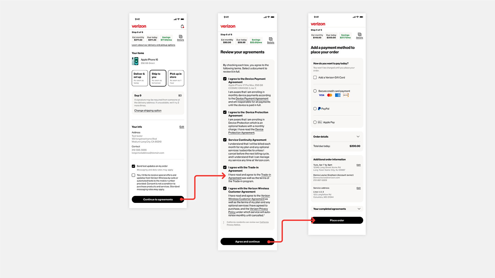
The proposed new design combined all required agreements onto one single page. Customers could open the agreements to review at will. The new design better aligned with industry standard for similar experiences and met the goals of Verizon's updated usability standards by reducing the number of steps required to completion.
The proposed new design combined all required agreements onto one single page. Customers could open the agreements to review at will. The new design better aligned with industry standard for similar experiences and met the goals of Verizon's updated usability standards by reducing the number of steps required to completion.
Default, filled, and error states of the finalized screen

Implementation & impact
Implementation & impact
Because of the quick turnaround time and connection to a larger product launch, it was decided to move ahead to implementation without a typical testing period. We believed, with high confidence, that the new experience would solve the problem we set out fix: to improve completion rates and provide a better experience to the customer.
Because of the quick turnaround time and connection to a larger product launch, it was decided to move ahead to implementation without a typical testing period. We believed, with high confidence, that the new experience would solve the problem we set out fix: to improve completion rates and provide a better experience to the customer.
The new experience combined all required terms and their acknowledgments into one single screen, significantly cutting down the number of clicks, screens, and required actions from the user.
The new experience combined all required terms and their acknowledgments into one single screen, significantly cutting down the number of clicks, screens, and required actions from the user.
Finalized flow significantly cuts down on the clicks and time required to complete